Deviation Actions

A New Road to Travel
Think about when you first found and joined deviantART. Did any of the symbols make sense? Did you stop and think "what is this ~ before my name and why is it there?" Maybe, but possibly you're probably like me and just kinda accepted it because that's the reality presented to you. After a while, though, you'd have seen the * and maybe even a ` or ^ and found out that they were a different type of member, but you probably still didn't know what that meant or even where to find out. I remember clearly that I absolutely had to have a * the moment a friend of mine got theirs. Was it because of the * or because of what it meant? Absolutely the later. It set you aside; it made you special. Well, that's how I felt at the time, anyway. Hopefully you can relate.
The other thing I felt was sadness. Having the old symbols was like part of your deviantART psyche. It's part of the landscape. Realising in that moment that we were going to lose those symbols (speaking selfishly as someone who never thought they'd ever get a $ in front of their name) and therefore some of our old identity was quite a moment. Let me assure you that everyone on staff feels the same. We are all aware that this is a very important thing for not only deviantART as a site, but more importantly for its community.The Brief
The initial brief for this project was that we would be replacing characters with icons that would be clearer in their meaning. At the outset we had the symbol be accompanied by a label. In fact, that was one of the primary reasons the new symbols would be moved from the left to the right of the user name.
Further more, I added to this by imposing technical requirements: symbols should scale in the same way as the original characters, feel like an extension of the username, work in multiple environments and not clash with the deviant avatars.
Initial Development

Clearly, whilst this worked for larger comment titles, it wasn't going to work for smaller areas. The choice at that point was to remove user name "labels" in smaller areas, or remove the text and place that in a tooltip (something we had in the works for a long while before the start of this project, but never seemed to make the live site). We chose the later, which moved us to this:

Initially this was fine, but the more I tested it, the more the box felt clunky and unnecessary. I was also realising that whilst the boxing might solve problems with spacing and icon size further down the road it wasn't going to scale.
From an Image to a Font
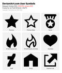
Creating the New Icons


The final issue was how to approach the staff icon. I didn't want to carry forward the dollar aspect of the symbol. This is something I think we generally disliked the connotations of, even though it was originally chosen because we were paid staff rather than volunteer staff. After a few failed attempts at things like peace icons, or a thumbs-up, I tested a lightning bolt which was closer in dimensions to the $, but it still didn't feel good.

Back to the drawing board


Anatomy for Beginners
Now I had a workable solution. The final set balanced nicely, looked roughly how we had stuff before and would scale.


And finally...
New stuff?
...and 5 years goes by
Star Wars The Force Awakens (no spoilers)
BETA Watch 2.0 Notes


I know for some people the user symbols are a collectors item, referring to forums where you can get a new icon by posting more threads / replies and such (This keeps the members active).
So maybe these are some great ideas to implement in the website:
1. Create medals or badges for adding art (maybe even different medals or badges for different kind of art), you can give bronze, silver, gold or platinum.
2. Create medals for having x times your art added to some else's favourites.
3. Create medals for being active x years.
And many more can be created for a community such as this one.
Positive side of having medals and/or badges is that members suffering of collect-illness (and this illness is contagious) will come back for more by adding more art and having a more active community.
Bad side for this idea is that there has to be made a new page for every member where they can show-off their medals and badges, just like the Llama badge we can receive.
Now, some of these can also be used as user symbols, like the medals and/or badges for being an active member over a X time of years.
And to make it even look cooler, the user symbols should be displayed before the nickname instead of behind it.
*Helldog2004 looks a lot cooler then Helldog2004* (Now the star falls into nothing in my opinion).
But the design looks really clean, and we should keep it that way, nice and simple.